Making the blog cover image responsive and smaller
How is it currently?
I migrated this blog and all is nice now, but the cover image bothers me a little, because it takes the majority of the bits you need to download to read a given article (at least if the article itself is not full of pictures).
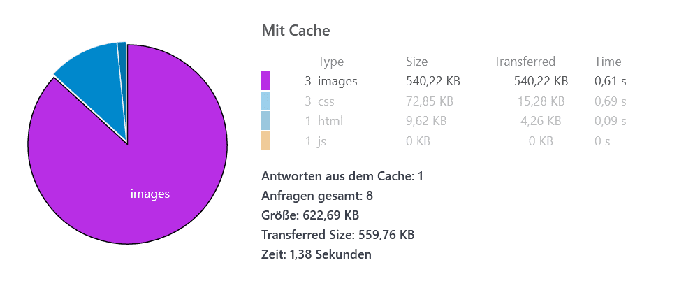
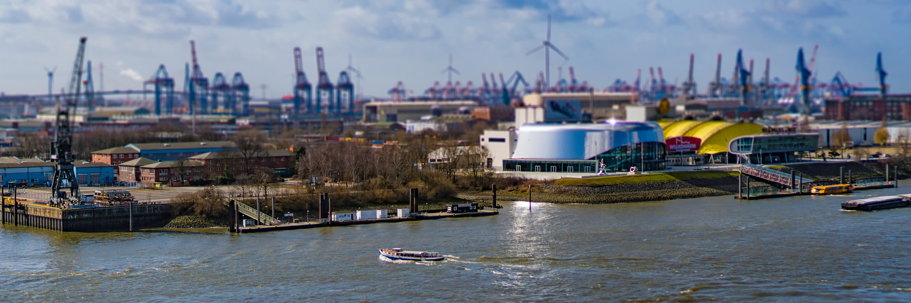
This is the network analysis from the article page of me anouncing that I migrated my blog to Hexo. The cover image itself has a size of 533kb. The complete group of requests has 651kb in size, so this image alone makes up 81,8% of it! This is okay, if you view this on a fast internet connection on a large computer. But if you view it on your phone on a flaky connection, this is probleblematic in two ways. First, you have to download this big image file and then, because your display on your phone is way smaller, your phone has to downsize the image.
Responsive images
The way to solve this is through responsive images. It basically says there is an image and it exists in several sizes on the server and the browser can choose based on different criteria, what image it is downloading exactly. This way, your phone would download a small image and your desktop would choose a larger one.
Sample (from w3schools):
1 | <picture> |
Alternatively, there is the srcset attribute on the img tag, which tells the browser as well, that there is the same image in different dimensions available on the server:
Sample (from css-tricks.com):
1 | <img src="small.jpg" srcset="medium.jpg 1000w, large.jpg 2000w" alt="yah"> |
Reality is always more difficult
The header image was implemented as a CSS-background, so I had to convert this to an actual image first. I liked also to have the post title on top of the image but I realized, this is not really possible with all screen sizes and resolution and title lengths, so I changed the design slightly to let the headline start only after the cover image.
Finally I settled with the srcset on the img tag, because, it is easier and I do not require the extra artistic possibilities the picture tag provides.
Reducing image sizes
I now provide the images in several different sizes and for a good measure, I use the new jpeg encoder guetzli from Google
It is a commandline tool and I use it like this:
1 | guetzli_windows_x86-64.exe --quality 85 original.jpg optimized.jpg |
It regularly yields very good additional savings in filesize without any noticable visual degradations.
Scripting it!
The first step is to create the image in different sizes with 100% quality. I will do this manually for now. But I created a PowerShell script which calls guetzli on all of the images, renames the outputs and writes a summary for the frontmatter of a given blog post.
1 | $images = dir *.jpg | sort -Descending length | select -Skip 1 | sort length |
Show me results!
So the final saving mainly depends on the screen size of the device. This post (not the same as above!) requires a dowload of 774kb on my surface but only 305kb on a Galaxy S6 for example. So this is more than acceptable to me. Also, the images are not the leading part anymore:
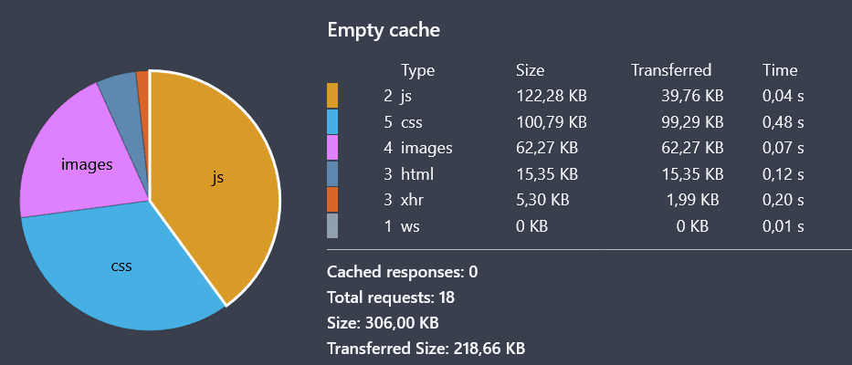
Notice, I made the results screenshot using this post but without the results screenshot itself, so now, the result is not true anymore
Also notice, I am using the local hexo serve mode, which includes BrowserSync, which is in turn responsable for most of the javascript.